Give your AI app a tactile glass interface: a hands-on guide to Solid Glass
Every AI app ships the same flat chat bubbles. Solid Glass is a design system built for AI interfaces that gives agent workspaces a physical, tactile feel — glass you can almost touch — while staying one shadcn/ui install away.
npx shadcn@latest add deeplethe/solid-glass/<name>. Your existing components need no changes.- Solid Glass by DeepLethe (deeplethe/solid-glass), MIT license — a design system for AI applications
- Published 2026-10-12; ~1,685 GitHub stars in its first five days
- Built on shadcn/ui: React 19, Tailwind CSS 4, Base UI components
- One stylesheet (solid-glass.css): colours, three thicknesses of glass, one state, motion
- Registry holds the stylesheet, 12 agent-oriented components and the agent-workspace block
- Dark is the material as designed; a light theme is included
Open any AI app built in the last two years and you see the same thing: flat chat bubbles on a flat background, a typing indicator, maybe a sidebar. It works, but it tells the user nothing about what the agent is actually doing — which step it is on, what it is waiting for, how full its context is, whether it needs a decision. Solid Glass is a design system that treats those as first-class interface problems. It gives agent interfaces a physical, tactile material — glass you can almost touch — while staying one npx command away from the shadcn/ui setup you already know.
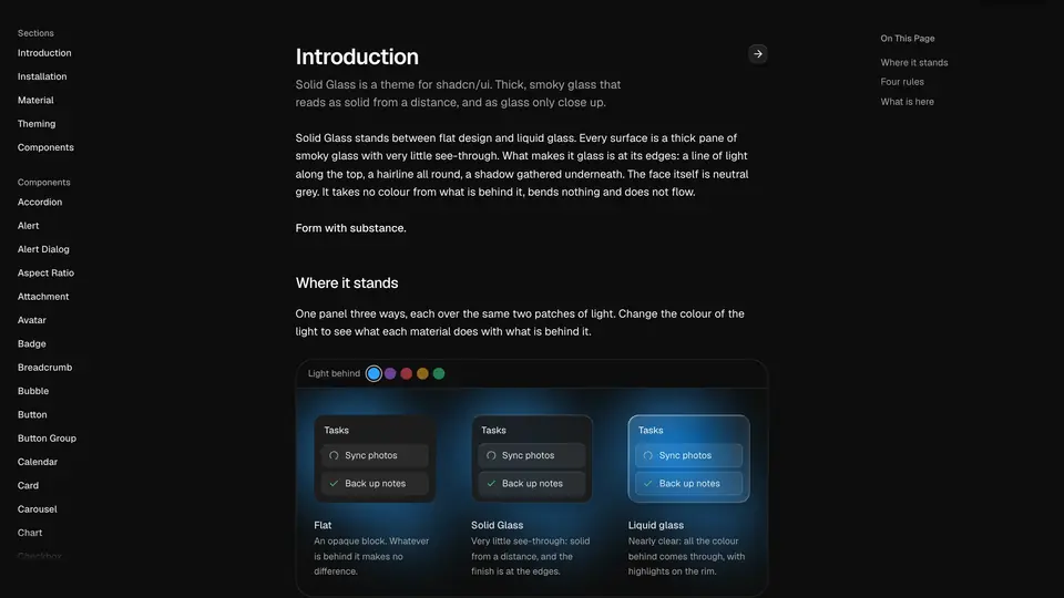
The project's own framing is useful: it stands between flat design and liquid glass. Flat is an opaque block with no finish to speak of; liquid glass is nearly clear, and on a page full of text the reader is always fighting the background for the words. Solid Glass lets only an outline through — enough to know it is glass, not enough to get in the way of reading. Delicate highlights, fine borders and soft shadows create depth, while a restrained finish keeps the emphasis on clarity and stability.
The numbers suggest it landed: deeplethe/solid-glass (MIT) was published on 2026-10-12 and picked up roughly 1,685 stars in its first five days. What follows is a hands-on pass through installing it in a real app — the stylesheet, the agent components, and a full agent workspace block — verified against the project's README and registry.
What you'll need
- Node.js 18+ with
npm/npx, and a code editor. - A shadcn/ui project (React 19, Tailwind CSS 4, the Base UI components) — or ten minutes to scaffold one in Step 1.
- No API keys, no GPU, no build service. This is a stylesheet plus a component registry; everything runs locally.
Step 1 — Scaffold the shadcn/ui base
Solid Glass is one stylesheet that restyles shadcn/ui components in place, so you start from a standard shadcn/ui project:
npx shadcn@latest initAnswer the prompts for the React 19 / Tailwind CSS 4 / Base UI setup the theme expects. If you already have such a project, skip this step — the stylesheet finds each part of a component by its data-slot and the classes it already carries, so your existing components need no changes.
Step 2 — Install the Solid Glass stylesheet
The whole material ships as one file, solid-glass.css — colours, the three thicknesses of glass, the one state, motion — installed straight from the project's registry:
npx shadcn@latest add deeplethe/solid-glass/solid-glassThen import it after Tailwind and shadcn's own stylesheet, and delete the :root and .dark colour variables that shadcn init wrote — Solid Glass defines the same names itself:
@import "tailwindcss";
@import "tw-animate-css";
@import "shadcn/tailwind.css";
@import "./solid-glass.css";
Dark is the material as designed; a light theme ships too. Reload your app and every shadcn component — buttons, inputs, dialogs, sheets, sidebars — now renders in the glass material. Nothing else in your code changed.
Step 3 — Add the agent components
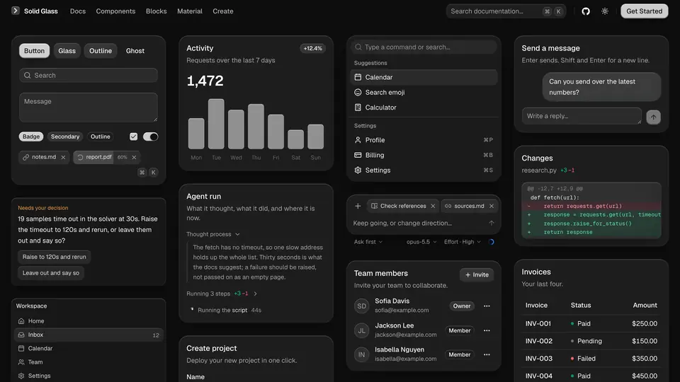
This is where Solid Glass stops being a theme and becomes a design system for AI applications. The registry holds components for the moments flat chat UIs handle badly:
npx shadcn@latest add deeplethe/solid-glass/status-glyph
npx shadcn@latest add deeplethe/solid-glass/turn-status
npx shadcn@latest add deeplethe/solid-glass/tool-steps
npx shadcn@latest add deeplethe/solid-glass/composerstatus-glyph— three points of light that say a turn is going, and what it is doing.turn-status— the agent's status line: what it is working on right now.tool-steps— the steps the agent took, expandable, instead of a wall of JSON.composer— the box you write to it in.- Also in the registry:
panel,tag,dot-loader,diff-view,ask-card,context-ring(how full its context is),task-noticeandreasoning.
Step 4 — Compose an agent workspace
Individual components are half the story. The registry also ships blocks — whole screens made of the components, to look at, read and copy in. Solid Glass's own block is agent-workspace: sessions, the thread, files and background tasks in one layout, pulled in with the same command pattern:
npx shadcn@latest add deeplethe/solid-glass/agent-workspaceDrop it into a route, run npm run dev, and you have the shape of a serious agent product: a session list on the left, the working thread in the middle with tool steps and diffs inline, files and background tasks on the right. Replace the demo data with your own agent's state and you are most of the way to a shippable interface.
Step 5 — Tune the material
Glass is a material with dials, and the project's documentation site exposes them: thickness, tint, chart colour, type, radius, rim and blur, each with a live preview and the few lines of CSS each choice produces. Start from the dark theme — it is the one the material was designed around — then adjust the dials until the interface feels like yours. The comparison the project draws is worth keeping in mind while you tune: flat hides the material, liquid glass lets the background fight the text, and Solid Glass keeps just the outline.
What you built, and the honest limitations
You built an agent workspace with a real material: a shadcn/ui app restyled by one stylesheet, agent-specific components (status, steps, diffs, context) installed from a registry, and a full workspace block composing them — all local, no API keys, in under an hour.
The honest limitations: this is a React 19 + Tailwind CSS 4 + Base UI story — it will not drop into an older stack or a non-shadcn codebase. It is a stylesheet and a component registry, not a runtime library; you are still in shadcn-land, which is the point, but do not expect it to wire up your agent's state for you. And it is days old: the registry names and the stylesheet variables could still shift, so pin what you install and check the docs site before upgrading.
Frequently asked questions
Do I have to change my existing shadcn/ui components?
No. The stylesheet finds each part of a component by its data-slot and the classes it already carries, so the components you have need no changes — you only add the stylesheet import and remove the :root and .dark variables shadcn init wrote.
Does Solid Glass work with older React or Tailwind versions?
It is built for the current shadcn/ui stack: React 19, Tailwind CSS 4 and the Base UI components. Older stacks are not the target — start from npx shadcn@latest init if your project predates them.
Is the light theme an afterthought?
Dark is the material as designed, but a light theme ships with it. If you tune the material's dials (thickness, tint, radius, rim, blur), do it on dark first, since that is the theme every decision was made against.